
Simple Ways to Display Books Without Cluttering a Room
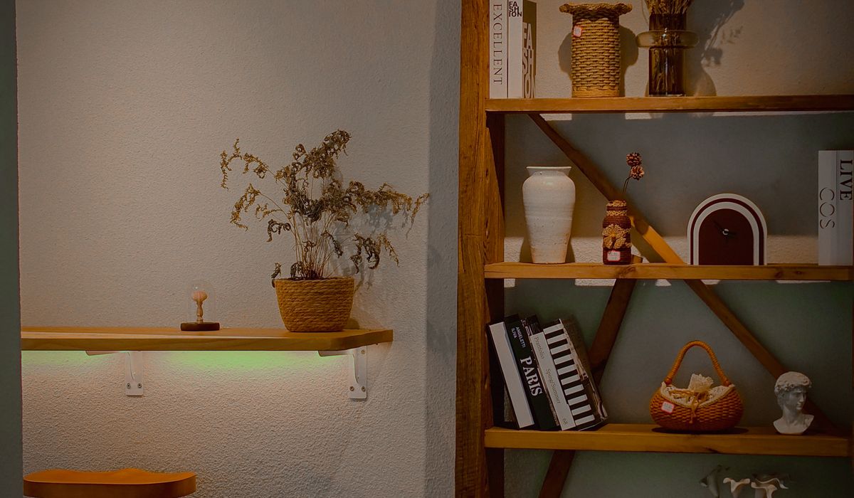
Start by Editing, Not Adding
The quickest way to make a bookshelf feel calm is to take things off it. Most of us treat shelves as storage first and display second, which is why they end up packed to the edges and impossible to look at without a slight sense of panic. Before you buy a single basket or rearrange a thing, clear one shelf completely. Lay everything out on the floor or a spare bed and ask yourself honestly whether each book has earned its place.
Set aside anything you will never read again, anything with a broken spine that you are only keeping out of guilt, and anything that belongs in a different room entirely. Cookery books work beautifully near the kitchen. Bedside thrillers and half-finished paperbacks belong upstairs. What is left is your display stock, and it will probably be smaller than you expect. That is the point.
While you work, keep a cloth and a small pot of wax or polish to hand. A wiped shelf with a little beeswax rubbed in instantly reads as cared for, and it makes the books sitting on it look considered rather than abandoned.
Group by Colour for Instant Order
Colour blocking is the single most effective trick for making a mixed shelf look deliberate. It works because your eye reads rhythm before it reads titles, and a run of similar spines creates a gentle, restful pattern even when the books themselves have nothing in common.
You do not need a full rainbow. Two or three tonal clusters often look better than an entire spectrum, especially in smaller rooms. Try these combinations:
- Warm neutrals — cream, oatmeal, tan and faded terracotta — for a soft, layered look in a sitting room.
- Deep blues and charcoals together for a stronger, more graphic shelf in a study or hallway.
- Greens in every shade, from sage to forest, which sit beautifully against painted alcove shelving.
- Two accent colours only, such as mustard and navy, repeated in small doses rather than filling the whole unit.
Break up a block of colour if it starts to feel heavy. A single white or black spine placed in the middle of a run of reds stops the eye and gives the shelf a little breathing room. If you have paperbacks with bright, busy covers, turn a few of them spine-in or stack them flat so the pages show instead — the pale edges act like punctuation.
Mix in Small Objects, but Choose Them Slowly
Books alone can look like a library rather than a home. A few carefully chosen objects soften the row and give the shelf a story. The trick is restraint: one object per shelf section, two at most, and always smaller than the books beside it.
Good candidates include a small ceramic bowl, a pair of brass candlesticks, a single framed photograph no taller than your hand, a pebble from a favourite beach, a small clock, a little jug. Natural materials — wood, stone, clay, linen — mix well with paper and card, so lean towards those rather than anything glossy or plastic.
Place objects at the front of the shelf rather than tucked behind books, and let them overlap slightly. A bowl sitting just in front of three upright books looks styled; the same bowl pushed into a gap looks forgotten. If you keep a collection, such as jugs, shells or tiny vases, group it in one place rather than scattering it across ten shelves.
Plants deserve a mention here. A small trailing ivy or a modest fern in a simple pot adds life without bulk, but avoid anything that will sprawl across your books and leave marks on the covers.
Leave Empty Space on Purpose
Empty space is not wasted space — it is what makes the rest look good. Aim to fill roughly three-quarters of each shelf and leave the final quarter clear. This gives the eye somewhere to rest and makes the whole unit feel lighter, which matters enormously in a smaller British room with low ceilings or a narrow alcove.
Vary where the gaps fall. A gap at the end of a row, a small space between two stacks, a shelf with only one row of books and a candle — this irregularity is what makes a display feel human rather than machine-arranged. Resist the urge to fill a gap the moment it appears.
Depth matters too. Push books back so their spines sit about an inch from the shelf edge rather than flush with it. This small recess creates a shadow line that frames the whole unit and instantly makes it look more considered.
Try a Few Different Arrangements
Not every book needs to stand upright. Varying the format keeps a shelf interesting and stops it reading as a solid block of spines.
- Stack three or four books horizontally and top them with a small object to make a low display.
- Alternate sections of upright books with one horizontal stack, repeated along the shelf.
- Use a stack as a small riser for a photograph or a little vase.
- Keep the tallest books at the outer edges and shorter ones in the middle to frame the shelf.
Do not overdo it. Two or three stacks across a whole unit is plenty; more than that and the shelf starts to look like a jumble sale.
Keep It Looking Good Week to Week
A styled shelf drifts. New books arrive, mugs get parked, post gets dumped. A five-minute tidy once a week keeps everything in shape. Return stray spines to their colour group, straighten the stacks, dust the objects and take away anything that does not belong.
Rotate rather than accumulate. Every few months, swap a handful of books from another room onto the main shelf and move some away. It costs nothing and the shelf feels new again, which is a very British sort of thrift — and a very satisfying one.

4 Comments