
Colour Drenching Small Rooms with Earthy Paint Shades
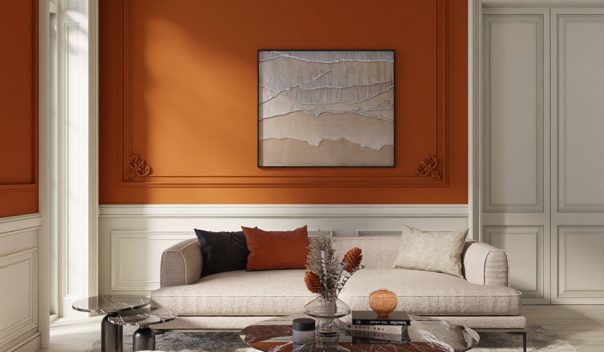
Why Colour Drenching Suits Compact British Rooms
Most of our homes were not built with generous proportions in mind. Victorian terraces, 1930s semis and post-war flats all share the same quiet problem: small box rooms with low ceilings, awkward chimney breasts and a single sash window doing all the heavy lifting. Painting the walls one colour, the ceiling bright white and the woodwork another shade creates a series of hard edges. Each edge tells your eye where the room stops, and in a compact space that message arrives very quickly indeed.
Colour drenching does the opposite. By painting walls, ceiling, skirting, architraves and even the door in closely related tones from the same warm family, you soften those boundaries. Corners recede, the ceiling lifts, and the room reads as one continuous shell rather than a box with a lid. It is one of the few decorating tricks that costs nothing extra and delivers a genuinely bigger-feeling space.
Choosing an Earthy Shade That Flatters British Light
Our light is soft, grey and often indirect, particularly in north-facing rooms. Cool greys and blue-whites can turn slightly chilly under that light, which is why earthy shades work so hard here. They carry just enough red, yellow or brown to warm the space without shouting.
Look for colours drawn from clay, stone and soil:
- Warm clay and terracotta – soft pinkish-browns that glow in afternoon sun and stay cosy after dark.
- Ochre and honey – gentle yellows with a brown base, excellent for hallways and north-facing studies.
- Mushroom and putty – the quiet workhorses. Greige with warmth, forgiving of imperfections and easy to live with.
- Sage and olive – green with a grey-brown undertone rather than a sharp, minty edge.
- Deep umber and chocolate – dramatic, but brilliant in tiny snugs and box bedrooms where you want cocooning rather than opening up.
Test any shade on at least two walls, plus a patch of ceiling. Paint large A4-ish swatches, leave them for a full day, and check them morning, midday and under lamplight. Earthy colours shift dramatically as the light changes, and a shade that looks wonderful at noon can turn muddy by 8pm.
Which Finish Goes Where
Drenching does not mean one tin of the same paint everywhere. Varying the finish adds quiet depth while keeping the colour story consistent.
Use a washable matt or eggshell on walls. Matt absorbs light and hides lumps and bumps in older plaster, which matters enormously in period properties. For ceilings, drop to a genuine matt in the same hue – dead flat, no sheen, so it never catches light and reveals every ripple.
Woodwork wants a harder-wearing eggshell or satin in the same colour, or a shade two steps lighter or darker. This subtle shift keeps skirtings and door frames visible without breaking the drench. If you want a little contrast, take the woodwork one notch deeper rather than switching to white. White skirting is the single thing most likely to chop a small room in half.
Radiators and pipework should be painted to match the wall. It is a small job and it makes a remarkable difference.
The Fifth Wall and the Forgotten Edges
The ceiling is where drenching earns its keep. A coloured ceiling lowers the apparent height of the room, which sounds counterintuitive in a small space but actually makes it feel more intimate and deliberate. Low ceilings stop looking like a limitation and start looking intentional.
Do not forget the details that betray a half-finished job:
- Inside the window reveal, so the light does not bounce off a bright white frame.
- The underside of any shelf, mantel or picture rail.
- Door edges and the inside face of the door itself.
- Beading around built-in cupboards and any boxing around pipes.
Furniture, Textiles and Light
A drenched room needs texture far more than it needs extra colour. With the shell unified, introduce interest through materials: a wool throw, a linen lampshade, a jute rug, a rattan chair, a worn leather armchair. These read as gentle variations rather than competing statements.
Keep large furniture in the same warm family – oatmeal, camel, rust, deep brown – and let one or two pieces sit slightly darker or lighter for contrast. Metals work beautifully against earthy tones; aged brass and oxidised bronze feel far more at home than polished chrome.
Lighting matters more than ever. Swap a single harsh ceiling pendant for two or three low-level sources: a table lamp with a warm bulb, a floor lamp angled into a corner, a picture light. In a drenched room, layered warm light makes the whole scheme sing.
Practical Prep and Common Pitfalls
Preparation makes the difference between a professional finish and a patchy one. Fill and sand thoroughly, then use a decent primer – especially over old gloss or a previous strong colour. Two coats of a good quality paint beat three thin coats of a cheap one every time.
Watch out for these traps:
- Mixing undertones. A pink-based clay and a green-based olive will fight each other. Keep every tone on the same side, warm or cool.
- Forgetting the test pot. Never commit to a whole room from a colour card.
- Over-accessorising. A drenched room plus busy patterns and bright cushions can feel chaotic. Edit ruthlessly.
Buy slightly more paint than you think you need, keep a small tin for touch-ups, and work in consistent light. Done well, colour drenching turns the smallest room in the house into the one everyone gravitates towards.

4 Comments